Pro Plan Personalisation Website
From UX Architecture to UI Delivery: A personalised platform for Nestlé Purina
Background
I was hired by McCann to support the launch of new Pro Plan dog and cat websites. The business had already defined a series of acquisition and conversion journeys spanning health education, product discovery, registration, trial packs, reviews and CRM follow-up. The ambition was to create a more personalised digital experience, moving beyond static product marketing towards something that adapted to each pet’s profile.
What did not yet exist was a coherent UX foundation capable of supporting that ambition. My role was to bring structure, clarity and usability to the experience.
Research and Information Architecture
Royal Canin had been identified as a benchmark within the category, so I began with a heuristic review of their platform, alongside other competitors. This gave me a clear view of prevailing interaction patterns, usability strengths and structural weaknesses across the market.
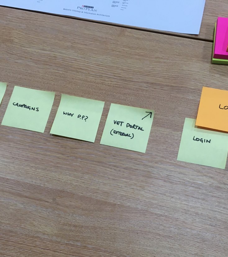
Although functional requirements were largely defined, the information architecture had not yet been validated. I ran a simple card sorting exercise to shape a sitemap grounded in user logic rather than internal categories. Owners think in terms of age, breed, health needs and lifecycle stages, and the IA needed to reflect that.
This phase established a clear navigational approach for the platform and ensured product selection, education and registration were connected in a way that felt natural.

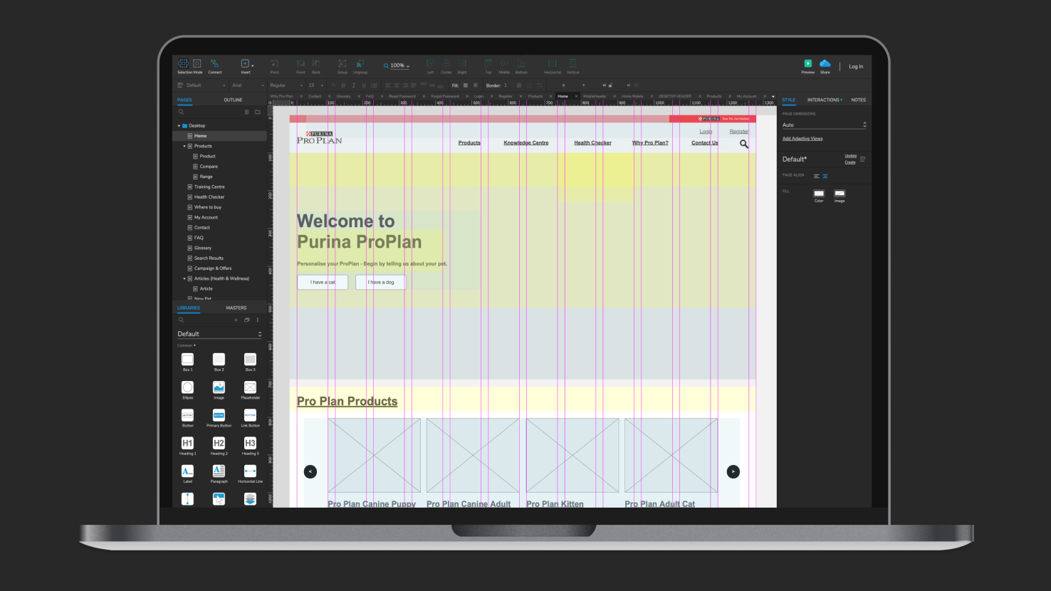
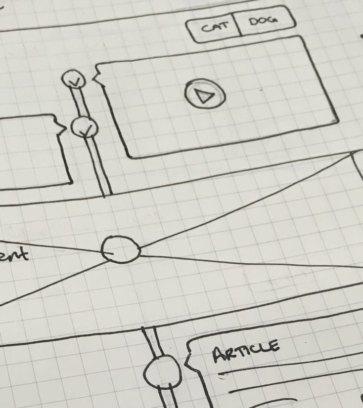
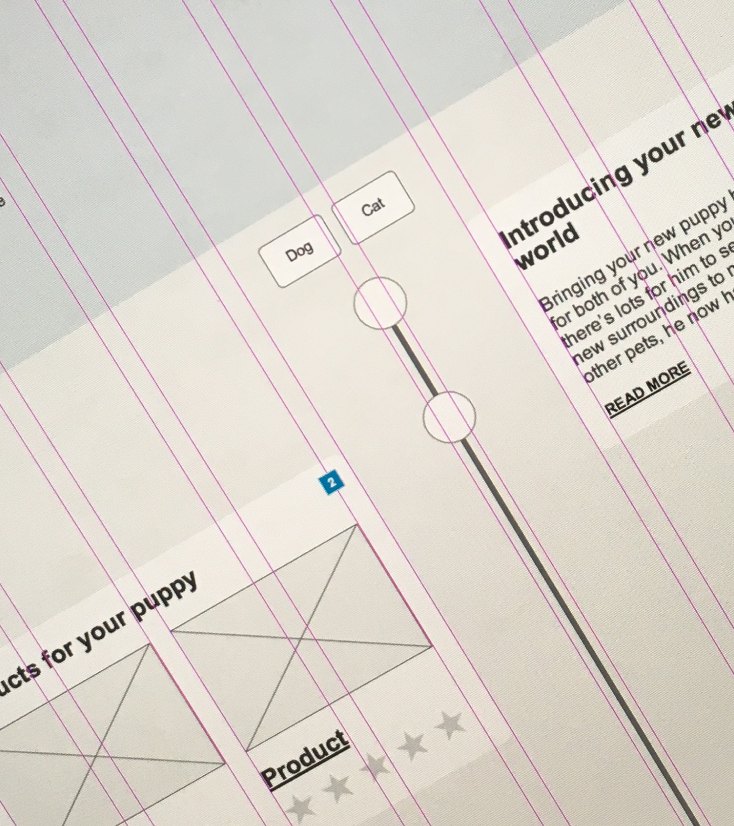
Prototyping the experience
With the structure in place, I moved into interactive prototyping using Axure RP. Instead of presenting static wireframes, I built a working model of the experience that allowed stakeholders to move through key journeys as if the site were live.
Users could register, add pets, edit profiles and see content adapt according to species, age and condition. Logged-in and logged-out states were explored in context. Conditional calls to action and tailored recommendations were modelled to demonstrate how personalisation would function across the site.
This approach made abstract discussions concrete. It exposed gaps in logic, clarified behavioural edge cases and created alignment before visual design began. Working in Agile sprints, I iterated directly within the prototype, refining flows as feedback emerged.
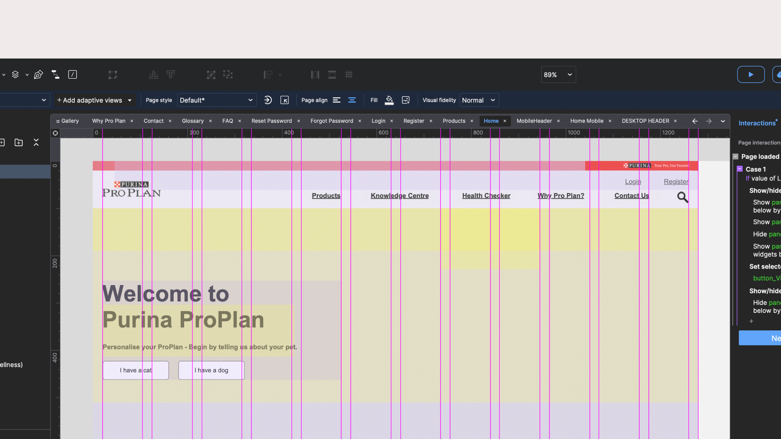
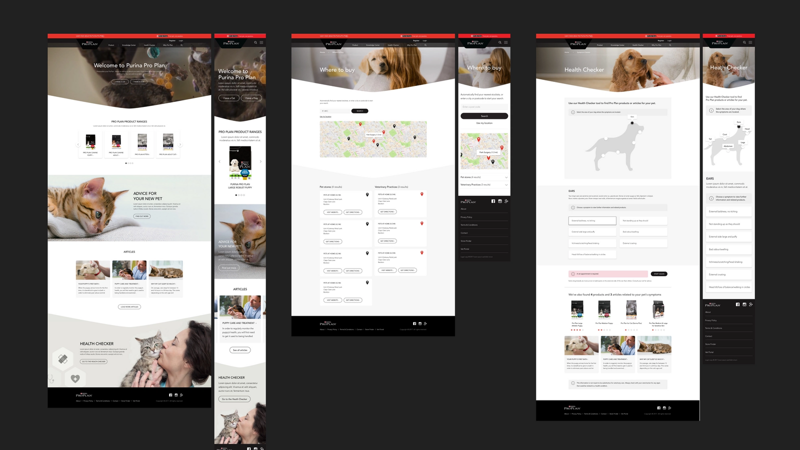
UI and delivery
As UX wrapped up, I transitioned into UI production, collaborating with the UI designer to translate validated flows into production-ready templates in Sketch. Because interaction logic had already been explored in depth, visual design focused on refinement and clarity rather than structural rework.
When resourcing shifted, I remained on the project to finalise interface designs and write the delivery documentation for the third-party development agency. This included annotated layouts and behavioural guidance to ensure the built product aligned with the validated experience.
Reflection
This project remains one of my most complete UX engagements. I was able to shape the information architecture, validate journeys through interactive prototyping and carry the work through to final delivery. It reflects the type of work I enjoy most: hands-on UX craft, turning complexity into something structured, usable and coherent on an end-to-end basis.